Friday, January 12, 2007

Pages 1-4


I could use some input on page 2, panel four. Not quite sure I'm interpreting the moment correctly. I know you want her fists to be clenched, but I'm having trouble visualizing the gesture in the script. Let me know what you're looking for, and I'll drop it in. Otherwise, I think everything is self explanatory. Nina's jacket is white because it makes it easier to control blacks in the layout, and prevents her from being this little black blob in the thumbnails. I'll change it to black in the finals, but control the silhouetting with both blacks and some application of grays. Send along any input you have, and I'll send you the next batch right after.
Thursday, December 28, 2006

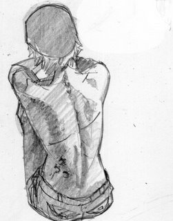
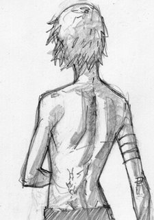
GSWs and other Scars


Couple of back sketches for Grey.

Wolf Mother

Wednesday, December 27, 2006

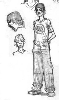
More Grey

Pause for Logos


Heh, I crack me up. Here I organized most of the logo ideas I had onto one page. I think you can see why I stayed away from one solid paw silhouette. Let me know if you're leaning towards any one of these, have something of your own, or want to go into a new direction altogether.

Logo


This is the logo I've been drawing most often. The upside down pointy paw. I started throwing the circle around it as I drew more Greys, don't know why.

Felson


Tuesday, December 26, 2006

Grey

Friday, December 22, 2006

Volk Profile

NIna Hair Grid


This is the type of shit no one cares about but me. This is just a hair grid for Nina, so I'm not just drawing a willy nilly silhouette blob of hair. Nailing down her part, and how her hair falls over. I also made some facial decisions here, with the upturn of the nose echoing a little of that Victorian stillness and attention to posture. I'm using enough of JC to be able to use a good pic for reference, but not need one for when the story needs something a little more stretched.

Doctor Volk


I'm not sure if I've said this before, but great fuckin' name, haha! This is the first step towards the actual style. I'm using geometric chapes to cut this into 4 tones or less: black, white, half tone and darker half tone or lighter halftone, depending on the lighting. The shapes are geometric, but still moving around the form according to general natural rules. The nice thing about this is I can push and pull the realism of this direction. It'll be more clear when I go to inks.

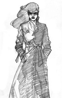
The Coat


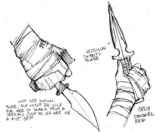
Hey B, here are a few. I gotta run and meet Sean, but I'll scan the Volks and Greys when I get back in tonight. I'm using a rotten, wretched monitor right now, so the clean up might be weird until I replace it, which will be very soon.